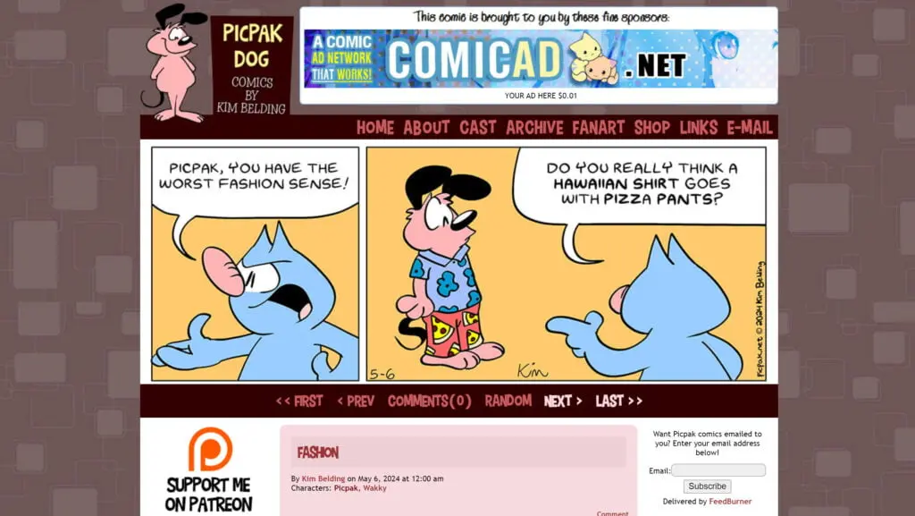
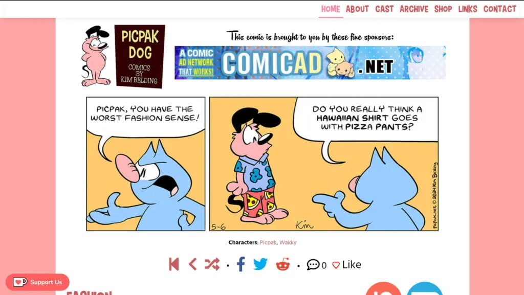
One thing that is unanimously praised about this website is its design. So much so that since 2013, its has been mostly left intact. While I was hesitant to change anything, I started re-evaluating what kind of comic Picpak Dog is in 2024, and what design best conforms to it. What you see now is the result.


Picpak Dog in 2024 is a comic that’s simple, clean, expressive and straightforward This new design plays off all those strengths, and the comic is front and center. The design itself is also simpler and cleaner as a whole, and looks great on mobile. The background of the old design was starting to give me 70s wallpaper vibes, which I wasn’t feeling. Much like the design, the content of the website also hasn’t changed in decades. Every page has been fine-tuned and updated to reflect where the comic is now, and using more modernized technology as a result.
Comic Easel is a WordPress plugin that’s reliably managed this website since 2010; unfortunately, it hasn’t been maintained in years. It’s only a matter of time before a major website update breaks the plugin completely (it’s already happened to PC Weenies). I’ve now migrated to Toocheke, a plugin that not only is actively maintained, but also lets you like comics (go ahead, click the heart)! I’m sure it will continue to get more cool features as time goes on.
I don’t use Twitter anymore. I’m sure you’re all sick of me telling you, but my attempt to make a Mastodon a thing among creatives failed pretty spectacularly. The site has been updated with references to my Bluesky, which is my most active social media network these days. If you subscribed to Picpak comics through Feedburner, you’ve all been migrated to my new Substack account, which not only sends e-mails, but is an all-in-one blogging/crowdfunding platform I hope to utilize more over time.
Like buying people a coffee? There’s a handy button to reach my Ko-Fi page at the bottom left! I also have a nice big link to my Patreon, which I may also revive. Every image across the site has been redrawn and polished, and the Links section has been revamped to add some of my new recent favourites. (If you aren’t there, don’t panic! I was a little aggressive with not including comics that hadn’t updated recently. I’ll probably go and add you back at some point!)
I think that pretty much covers it. Oh! If you’re on desktop, move your mouse over the logo. It’s really fun, I promise! Alright, now that’s everything. I hope you enjoy the new design as much as I do. I know it’s a drastic change, but I wanted a design that reflected what I liked about the original, while still keeping up and modernizing with the times. Please let me know your thoughts in the comments. Thanks for reading!


